Playing with colors in decor is one of the easiest ways to change the look of a stay without major reforms ways. Thinking of painting? Notes color trends for spring-summer 2016 that today we bring you, inspired by Pantone and Bruger proposals for this upcoming season.
Spring is the best time of year to introduce a touch of color joy to our home, and also an opportunity to update their appearance, filling color, and style, do we start?

Let yourself be conquered by the warmth peach
For several seasons, the family of the orange color scheme has been in the forefront of trends in colors. This spring takes over the peach, which provides greater warmth and brightness. Use it to add depth to a room, painting a wall peach, or to pay tribute to the beauty of natural resources by adding a touch with this key.
It combines perfectly with the black, but also white, for example, brighten a bathroom, especially if you do not have too much natural light. Paint only one wall and the outer tub and get a completely new look easily and quickly.
Lavender floral aroma
Let yourself be invaded by the serenity and calming effect of this soft color, the same that produces the simple wildflower that gives it its name and you can get the color lavender Provence Bruguer.
To avoid a sense of uniformity or monotony, but always within the harmony of this key, notes the blue, white and gray, which are revealed as their perfect partners.

Navy renovated
If there is a color that evokes the energy of the sea is blue. Although this spring appears in both versions always dark and in a tone navy, matt and clear, perfect for more contemporary styles. For the current and inspiring result, combine it with wood,one of the materials of the moment.
Bright yellow, dazzling home
Is about good weather. Anticipate to enjoy more sun adding to your home some element in radiant yellow, the brightest color for this season.
You get fill your home with joy and optimism if you paint your walls with this color. If you want to play it safe, commitment to combine gray, this visualizer from the intensity of yellow and will achieve both a set of highly topical.
You may also like to read another article on xWorld: Trends in wallpaper 2016
A touch of class with turquoise
If you like to take risks, dare to give a color effect by incorporating the turquoise to your home decor. Contrast that with elements in light shades that bring light and get a corner with a touch of modernity and distinction that you can not do without.
Introduce small details, such as various types of moldings decorated on the wall, painted the same blue, will help to give a touch Bohemian Chic.
Rose quartz and blue serenity, the most sought
The strong bet for the new season is pink quartz combined with the serenity blue. It is an ideal mix Nordic style homes, although they also can get a cozy romantic atmosphere.
Combines both colors, choosing one of two, either rose quartz or blue serenity, to prevail over the other. Together they form one of the most sought combinations of the time Do you dare?

Play with subtle shades of gray
If you run away from strong or bright colors you’re in luck, because among the new trends are also present neutral colors, among which the star is gray. Painted walls and doors of different shades of this color and combining them with wood furniture Nordic style and get provide brightness, but without sacrificing the uniformity of sober colors you are looking for.
You can also give a more industrial feel to a room as in the photo of the cover of the post, adding texture to the wall with a gray paint effect.
Vibrant red caldron for a dose of energy
A burst of energy, strength, lightness, this and more is what you can get if you adopt the most vibrant proposal upcoming trends. You’ll get the most cheerful kitchen if you adopt a color festive red for cabinet doors, countertop or a wall. It is impossible in such an environment you lazy cook.
For the strong color does not focus solely on kitchen furniture, you can also incorporate small elements play in the same key, as a fruit bowl or some cushion if you have table and chairs to eat in the kitchen.

Coffee with milk for a smooth change
Latte painting is the other neutral bet for this season. If you are one of those people who needs to adapt to seasonal change slowly, this color will serve as a basis to combine with other trends that form the color palette this season. Use it in its clearest to update the entry with a tone that can accompany long version.
And use your darker version and grayish to forma Belgian style, sober and elegant, in which the wood also takes on special prominence.
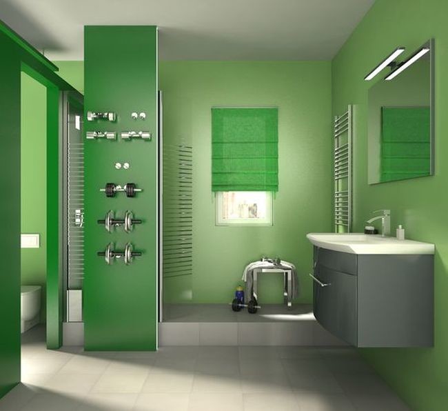
Bright green, pure spring
The spring proposal for urban environments is being seduced by the colors of nature is there any hue connect more with the explosion of vegetation, air countryside or the brightness of the summer months the brilliant or emerald green?
Mix it with gray and white, a safe bet that you’ll love for its elegance, or dare to combine different shades of green for a casual and youthful style to help you connect with nature.


